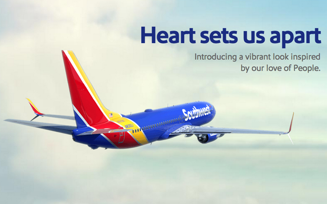
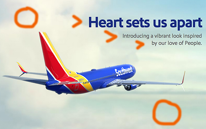
The ad above is for Southwest airlines. It was released in 2014. We will be discussing the design elements that make this a well-thought-out promotional tactic. This ad was found at https://archive.jsonline.com/business/southwest-unveils-new-paint-scheme-b99346877z1-274333001.html/.
Contrast
This ad does a great job with contrast. There are two things that your eyes are automatically drawn to. Firstly, the top line of words is a bigger text size and is bolded. Secondly, the plane has also been made a bigger size. This helps the viewers recognize the company and understand the main message of the advertisement more clearly.
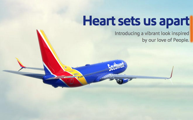
Alignment
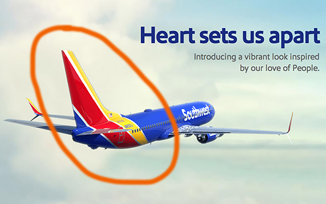
Alignment helps make a design look strong. This ad has put the wording flush right as indicated by the orange vertical line. The plane alignment is on the left side. This gives the image a sense of order. The information you need is in the same area and easily accessible.
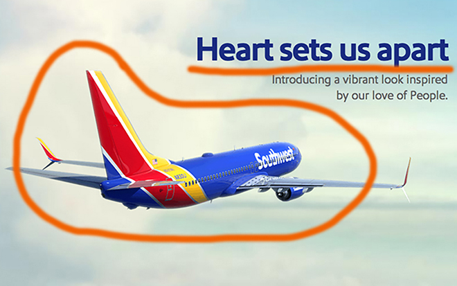
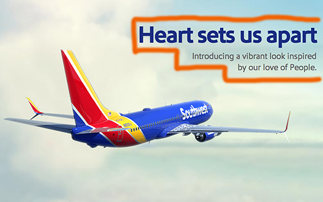
Proximity
The image below has the words boxed in. These words are grouped together because they are meant to be read together. The plane is also placed an appropriate distance from the text so as to fill in some of the white space. The airplane is angled in such a way that the plane looks like it is flying to greater heights. This emphasizes the company trying to go in a better direction.
Repetition
Repetition unifies a piece of work. The font is a repetition in this ad. The words “Heart sets us apart…” is the same font that can be found on the side of the Southwest airplanes. Another repeated object in this ad is the clouds. The background is covered in fluffy clouds. This helps the viewer see that the sky is a big part of what is involved with the business. It creates a sense of familiarity.
Color
There is a distinct color scheme for Southwest airlines. They use the primary triad, meaning the colors red, yellow, and blue. These primary colors really draw the eye. When you see this bright colors you are instantly drawn in. That then moves your eye to the blue letters and you read the message.
Conclusion
This ad is simple and to the point. The 5 principles of design are executed in such a way that we understand the message and the company being represented. The alignment and proximity bring a strength to the ad and the color intrigues you. Overall, this add was well thought out so that they would be drawn in and informed without unnecessary information.
