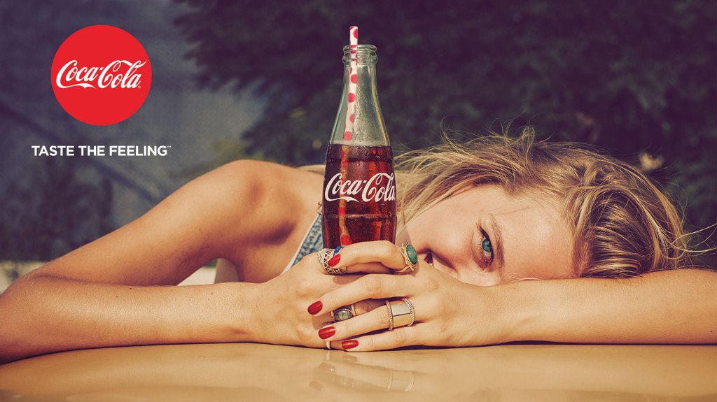
This Coca-Cola Ad above is a well-thought-out marketing job. It was found on a blog posted on January 19, 2016. We will be discussing the design, typography, and color elements that make it an effective ad. The ad was found at https://www.adweek.com/creativity/here-are-25-sweet-simple-ads-coca-colas-big-new-taste-feeling-campaign-169075/
Design
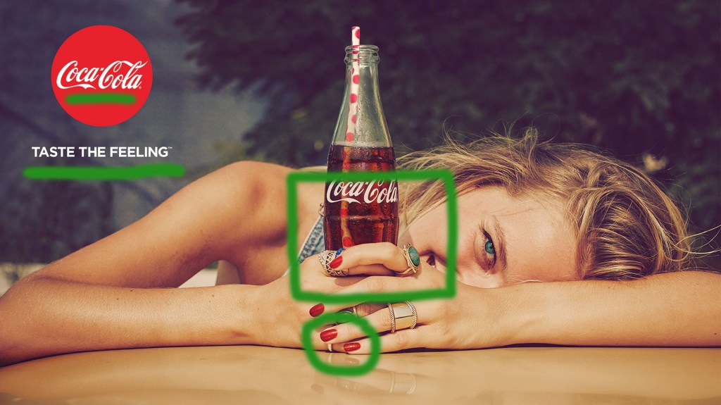
This is an original Coca-Cola ad. This is simplistic yet gets there message across. They do this with their strong left alignment of the text and logo. The proximity of the coke bottle with the straw and the girl’s smiling mouth show that this drink is to be enjoy. You can also see a repetition of the color red to emphasize the brand.
Color
The also used red and green colors which are complementary and makes the red stand out even more. The other colors are muted so that the red can attract the eyes. That is what you noticed about this ad. The ring and women’s eyes are a pop of green to also attract attention to the center on this ad.
Typography
The typography used in this ad is Coca-Cola original fonts. The Logo is a decorative font and the text underneath is in a san serif. This is a good contrasting font for the cursive. It is clean and has no serifs which would be to close the the swirls of the decorative one.
Design
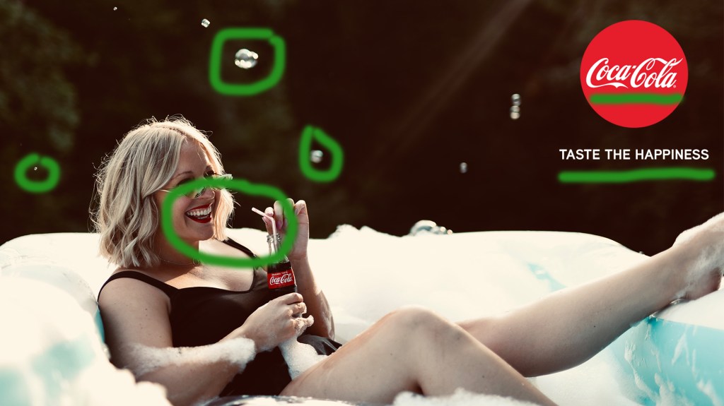
This is a recreated ad that I did. It is similar to the above ad. There is a similar alignment of the logo and text but is on the right side. This picture also has the proximity of the smiling women mouth and the straw and bottle. We have the repetition on bubbles in this one which can invite the image of soda bubbling, and in the red of the logo, lipstick, and soda label.
Color
The complementary colors of red and green are also used. You can see this in the red of the label, logo, and lipstick and the green of the background. Again we see in this new add the colors are muted so that the brand stands out more. There is also a pop of blue from the pool. This helps you focus on the bottom half of the image.
Typography
The type font used for this ad is Aaux Next Bold and is similar to the one used in the original ad. This is another san serif and is a clean font. It is place right under the logo and attracts the eye right after reading the brand. This helps the reader notice the main message of the brand.
Conclusion
These two ads work for the same campaign. Firstly, because both are set outside in the summer seasons. There are also females that are relaxing, happy, and holding Coca-Cola bottles. There is also a repetition of red. The original ad has the logo, nails, and bottle and the new one have the logo, lipstick, and bottle. The message of both ads is similar and stating that drinking coke is a pleasurable experience. All of these reason help make the new ad work for the same campaign.
