The magazine spread above is layout created for Inspire Magazine. It was found on a blog posted on January 17, 2012. We will be discussing the typography and photography elements that make this a smart magazine article. This ad was found at http://www.studentshow.com/gallery/2906107/Inspire-Magazine-Layout
Category Identification
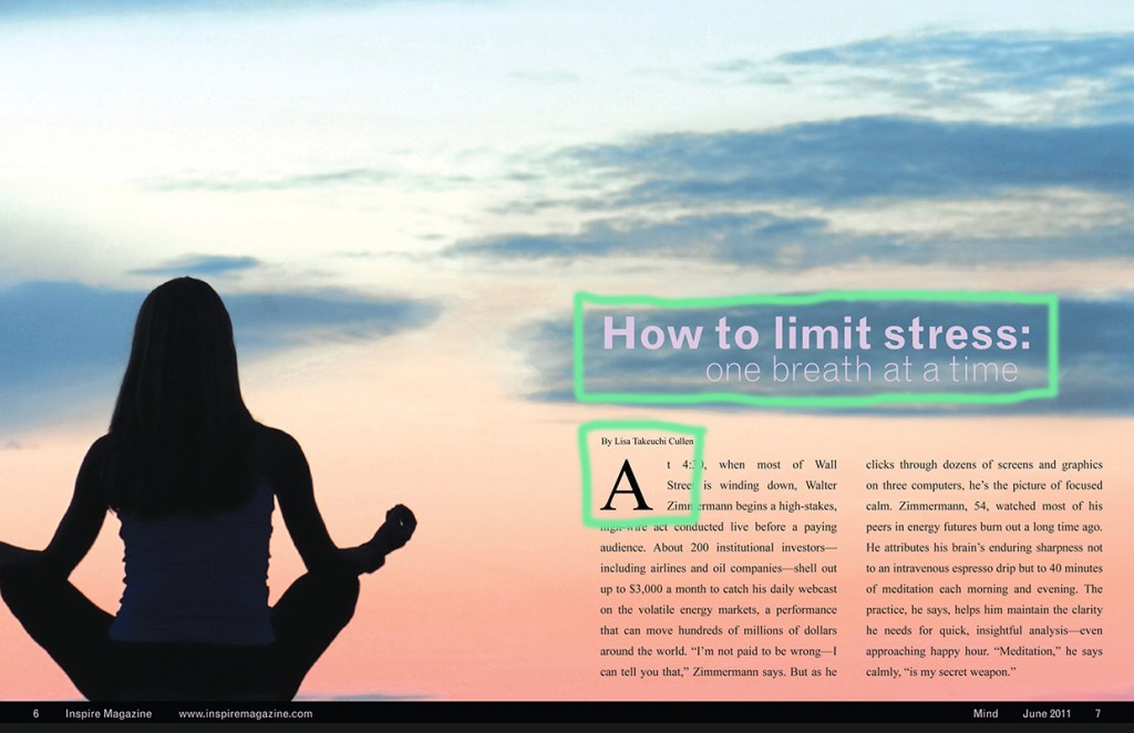
There are two categories of type that are used in the magazine layout. The first is “San Serif”. The words that are in purple are in this typography. They are identified by the lack of serifs and stress as well as the consistences of either thick or thin stroke. The second type-style used is “Oldstyle”. This type is identified by its diagonal stress and serifs and a minimal stroke change.
Typeface Contrast
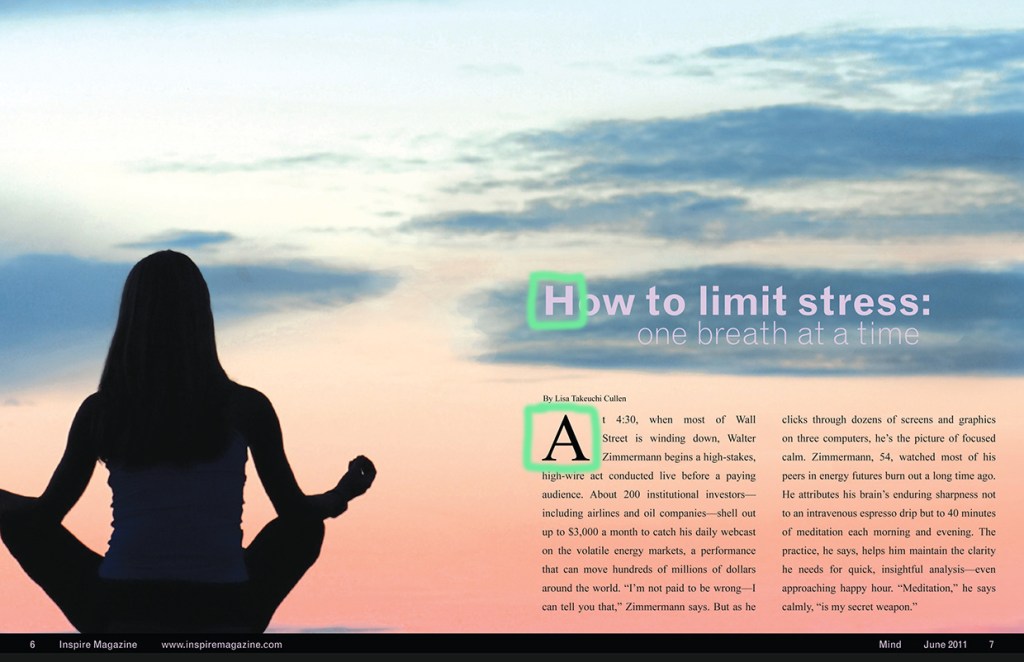
San Serif and Oldstyle are good contrasting types because one uses no stroke change and the other has both serifs and changes in stroke. These alone do not make the article stand out. There are three other contrasting elements that help accomplish this. The first two are size and weight. The top line and the letter “A” are both bigger sizes and more bold. These help indicate the message of the article and the beginning. Structure is also demonstrated with the title of the article. “How to limit stress” and “one breath at a time” are in the same font but have a different thickness to them.
Photography
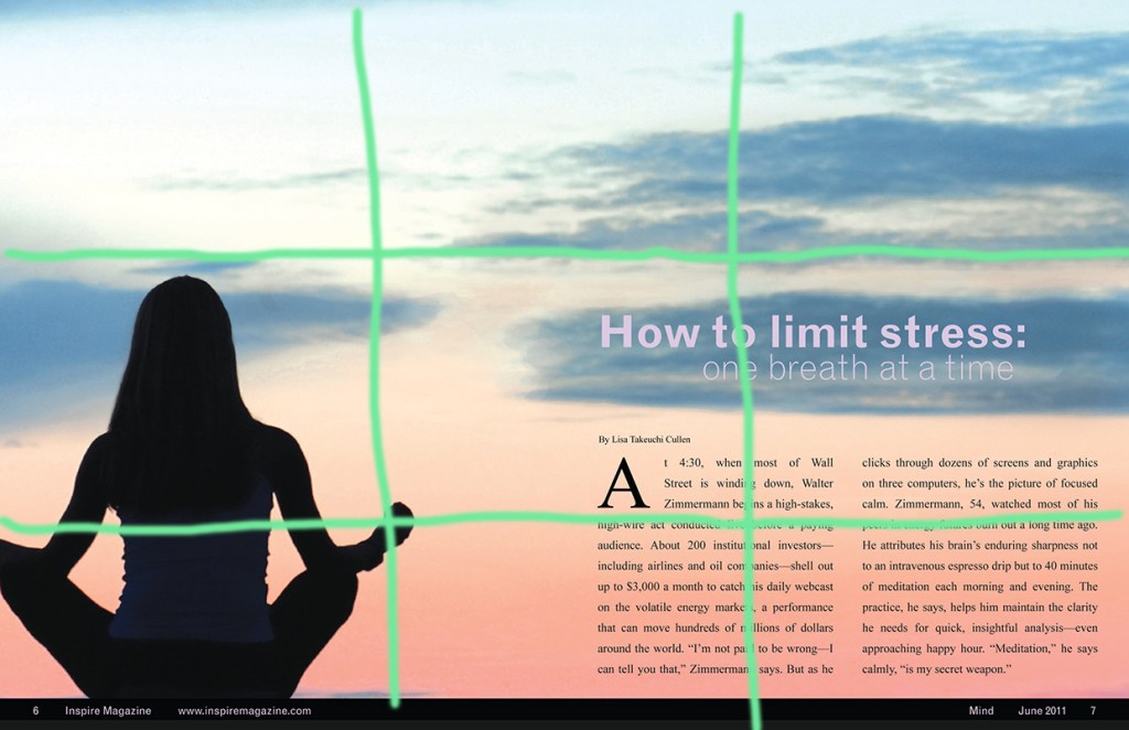
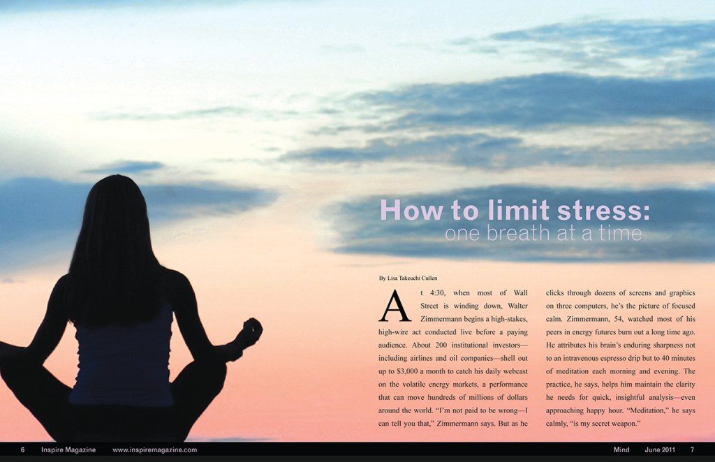
This photographer used the rule of thirds with this image. The subject, in this case the female doing yoga, is placed to the left and in the middle and lower quadrant. The background of the image is a sunrise or sunset. The clouds in the image help to balance the photo. The sky creates a sense of peace and calm. The artist purposefully did this to reiterate the feels that yoga can bring to a person.
Alternative Images to Use
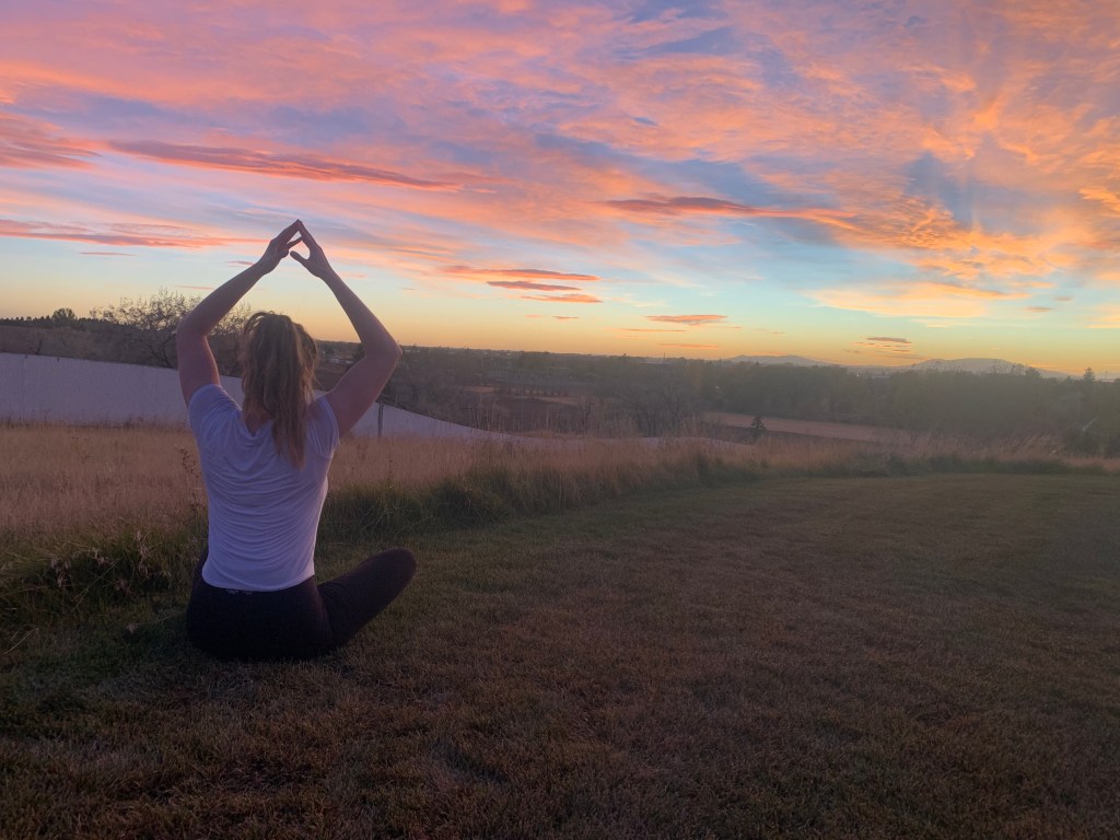
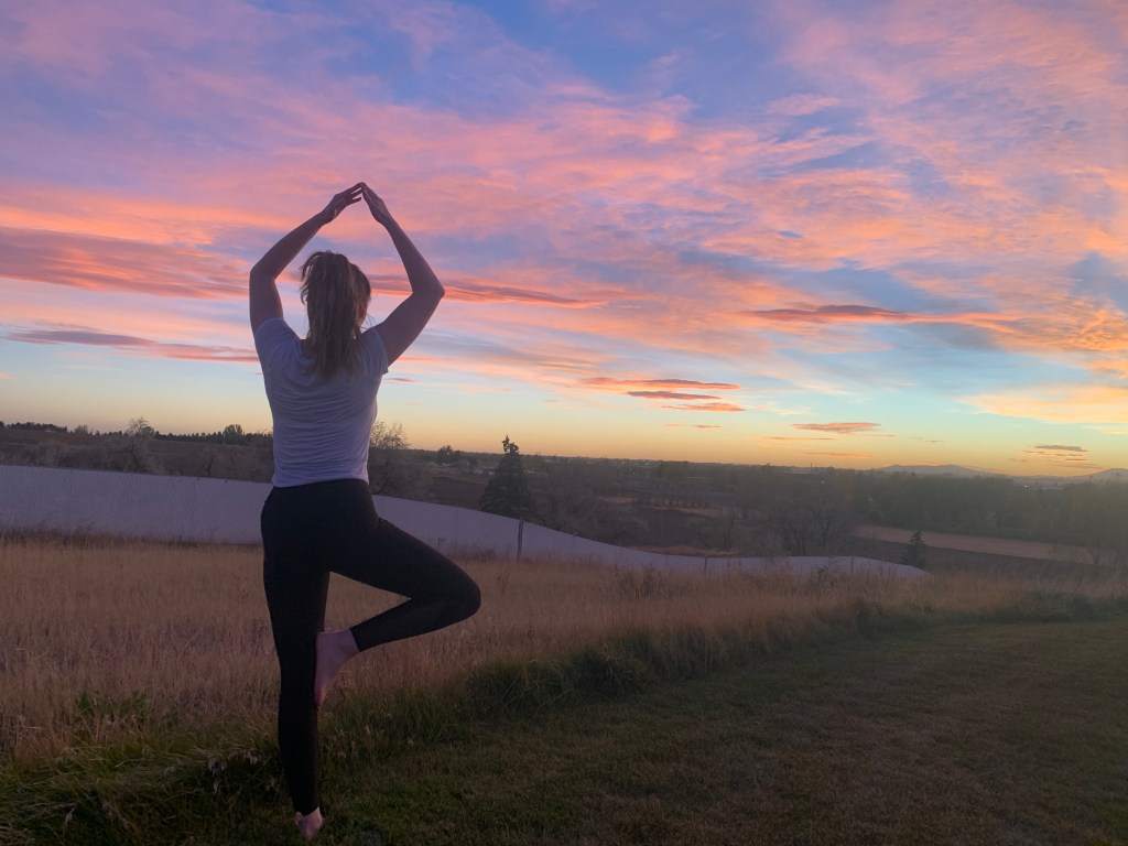
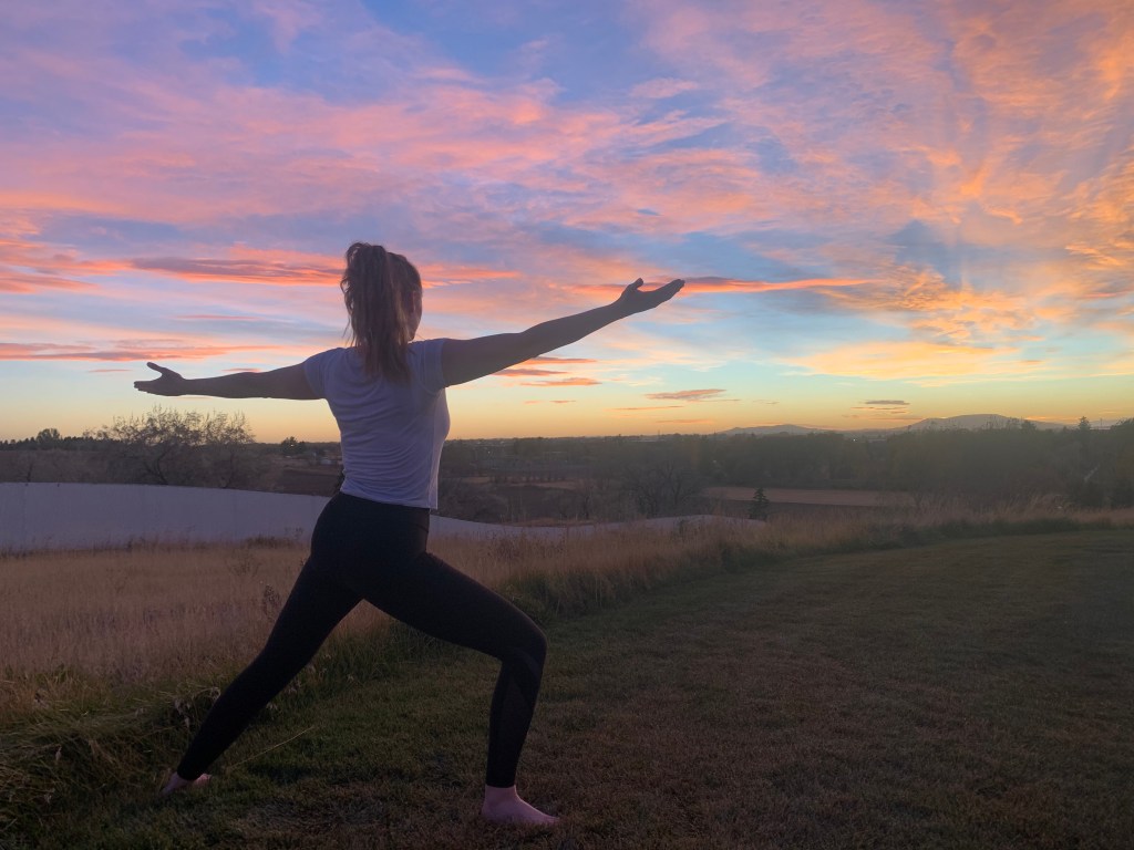
These photos could all replace the original one. They are following the original artists rule of thirds. In each of these photos the subject is off the the left side of the image leaving space for the text on the right side. The alternative photos also have the same theme, yoga. They were taken at a similar time of day to achieve the sunrise and sunset background.
Summary
The Photograph used for the spread was well-thought-out. The colors used are calming and inviting. The image is relevant to the subject. They help get the main message across. The use of the “San Serif” and “Oldstyle” types helps section out the spread. The contrasting elements help direct our eyes. The size of the title helps us know exactly what we are about to read. The elements complement one another to make this a please yet simplistic magazine spread, which fits the ideals of yoga.